Spirit Airlines: Owning the truth at 35,000 feet by designing honesty into a brand advantage

(01)Project overview
From haters to high flyers, designing transparency that people could actually understand.
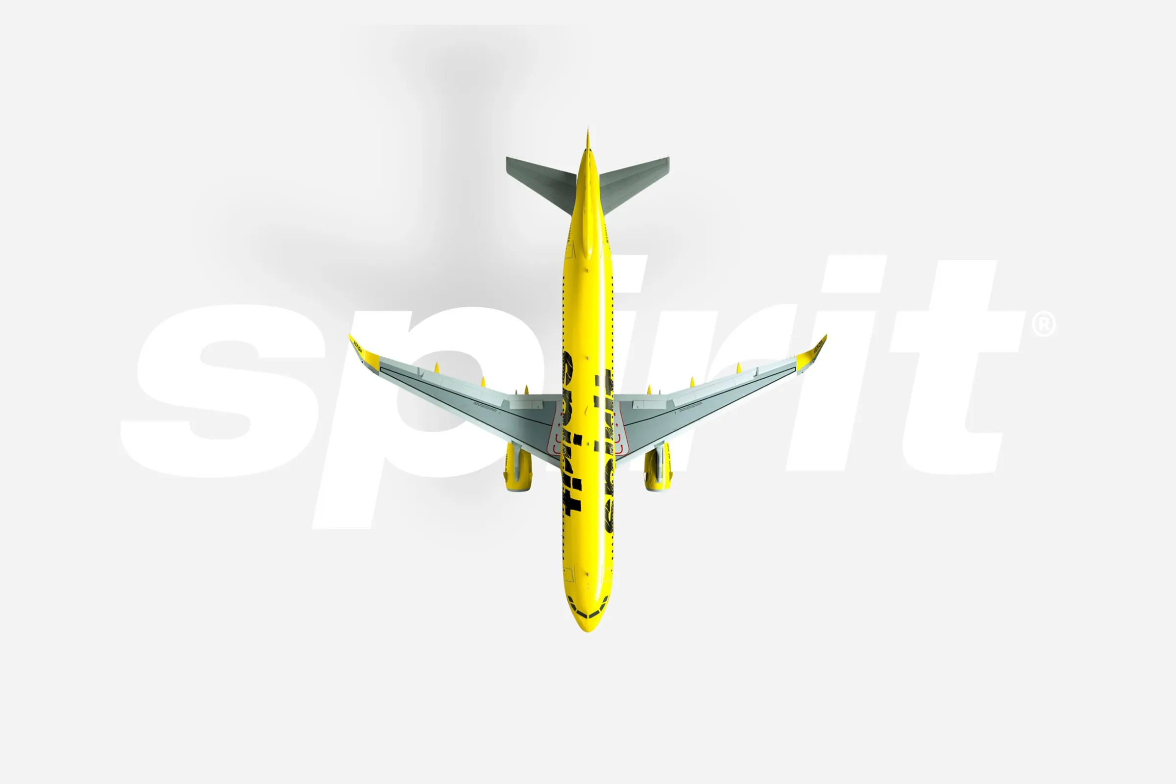
Spirit Airlines is an ultra-low-cost airline built on a simple trade-off: lower fares in exchange for optional add-ons. While the business model was soundly understood internally, the brand struggled with public perception driven by confusion, surprise and misaligned expectations. This engagement focused on supporting Spirit’s decision to embrace radical transparency, translating an unapologetic brand stance into clear, scalable creative execution across campaigns and digital experiences.
Rather than softening the message or repositioning the model, the work centered on making the value exchange unmistakable. Through disciplined art direction, campaign execution, website layout updates and UX support, the project treated clarity as the product. The result was a brand and digital experience designed to help customers understand the deal quickly, confidently and without apology, turning honesty into a usable brand advantage at scale.
Project details
- Client
- Spirit Airlines
- Headquarters
- Miramar, Florida
- Agency
- Freelance / contractor
- Industry
- Hospitality, travel
- Engagement
- Brand strategy, Brand identity, Website design
- Role
- Brand strategy, Design leadership, UX design lead, Digital strategy, Art direction
Key outcomes
- 100+Campaign executions supporting Spirit’s transparency-driven brand narrative
- 20+Landing pages and microsites designed for clarity, speed and conversion
- 40+Illustration and motion assets extending the brand system across channels
(02)The context
The model was fine. People just didn’t like hearing the truth.
Spirit Airlines did not have a broken business model. It had a misunderstanding. While investors understood the economics, customers associated the brand with frustration, surprise fees and noise.
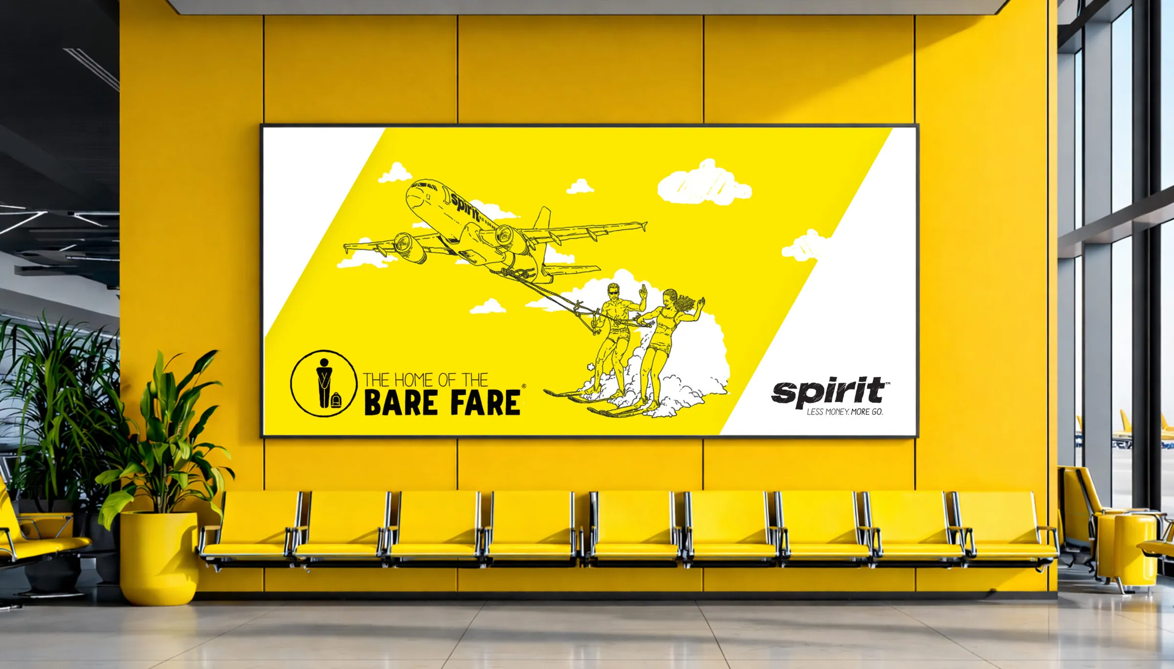
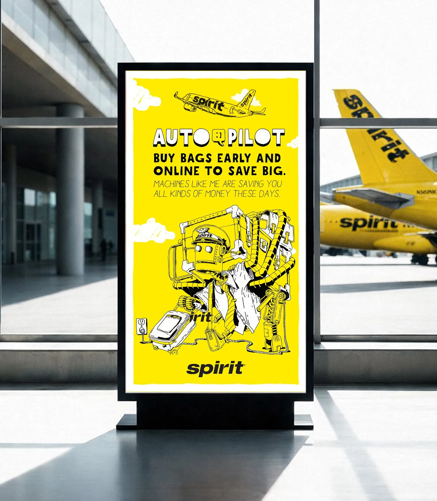
To address this gap, Spirit publicly launched its Bare Fare campaign, an initiative (Barkley Agency) to explain its unbundled pricing structure and make the trade-offs explicit, choosing transparency over apology, as documented in industry coverage of the airline’s repositioning and consumer education efforts (Adweek).
Leadership made a deliberate call to stop explaining the model through conventional airline language and start owning it outright. Low fares. Optional add-ons. No apologies.
That decision reframed the creative problem entirely. When a brand chooses provocation over reassurance, execution stops being expressive and starts becoming structural. Humor has to be precise. Design has to stay legible. Every touchpoint must reinforce understanding rather than amplify confusion. The task was to operationalize radical transparency into a visual and experiential system that could scale.
(03)The challenge
You can’t joke your way out of confusion, no matter how funny you are.
Spirit’s reputation already had momentum. The challenge was not inventing a new story, but reframing an existing one without breaking trust or usability.
Spirit needed to educate customers without sounding defensive, express confidence without pretending the experience was something it was not, and modernize digital touchpoints so the brand voice felt intentional everywhere it appeared.
What I did
- Campaign creative implementation
- Landing pages and microsites
- Website layout updates and branded UI patterns
- Art direction, illustration and motion assets
- UX support for booking, pricing and promotions

(04)The strategy
Radical transparency, no fine print and zero winking asterisks.
Brand strategy was defined by internal leadership. The creative strategy was executional: make Spirit instantly understandable.
The work leaned into radical transparency and self-aware humor, treating honesty as the hook and clarity as the payoff. Rather than trying to convert skeptics, the goal was recognition. If customers understood the trade-off, the brand had done its job.
What I did
- Tone and voice guardrails
- Messaging hierarchy for transparency
- Channel alignment across web, email and campaign touchpoints
- Visual system application at scale
- Editorial and design checks for clarity
Mobile campaign pages
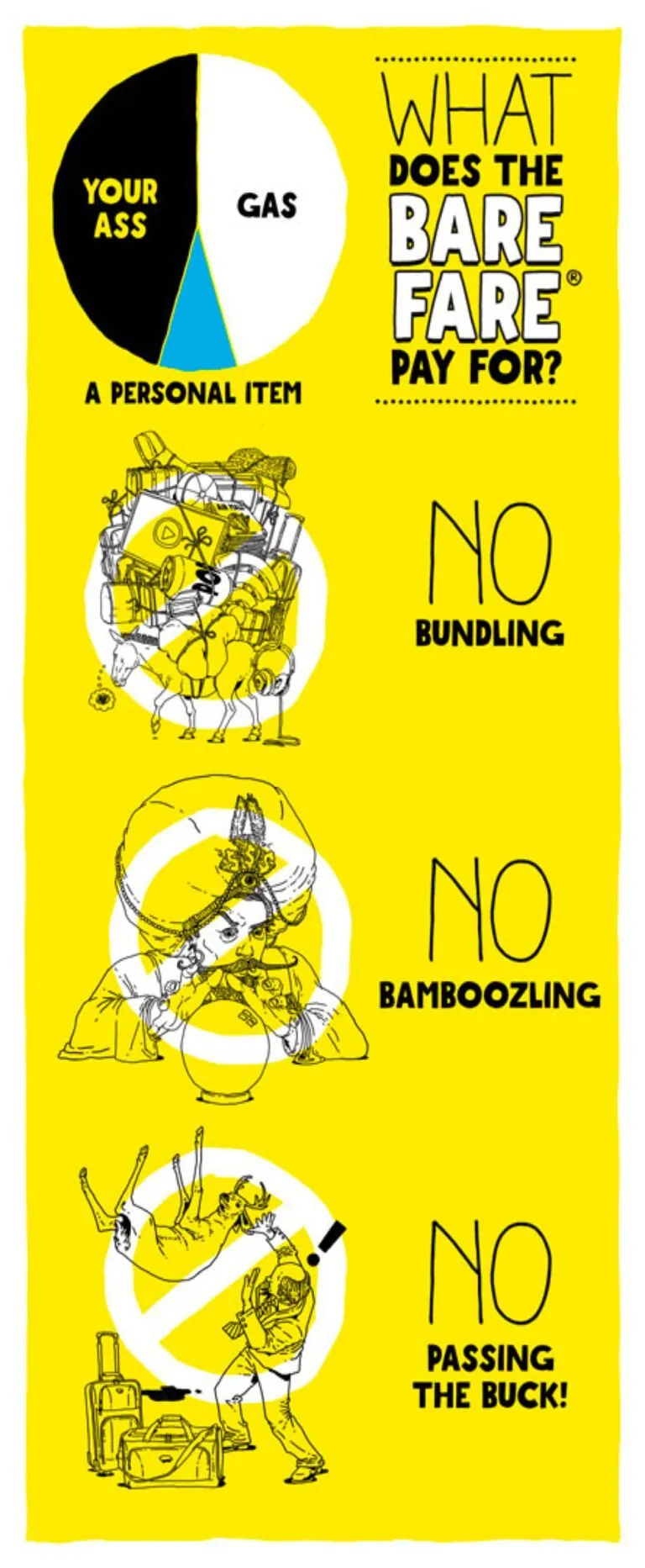
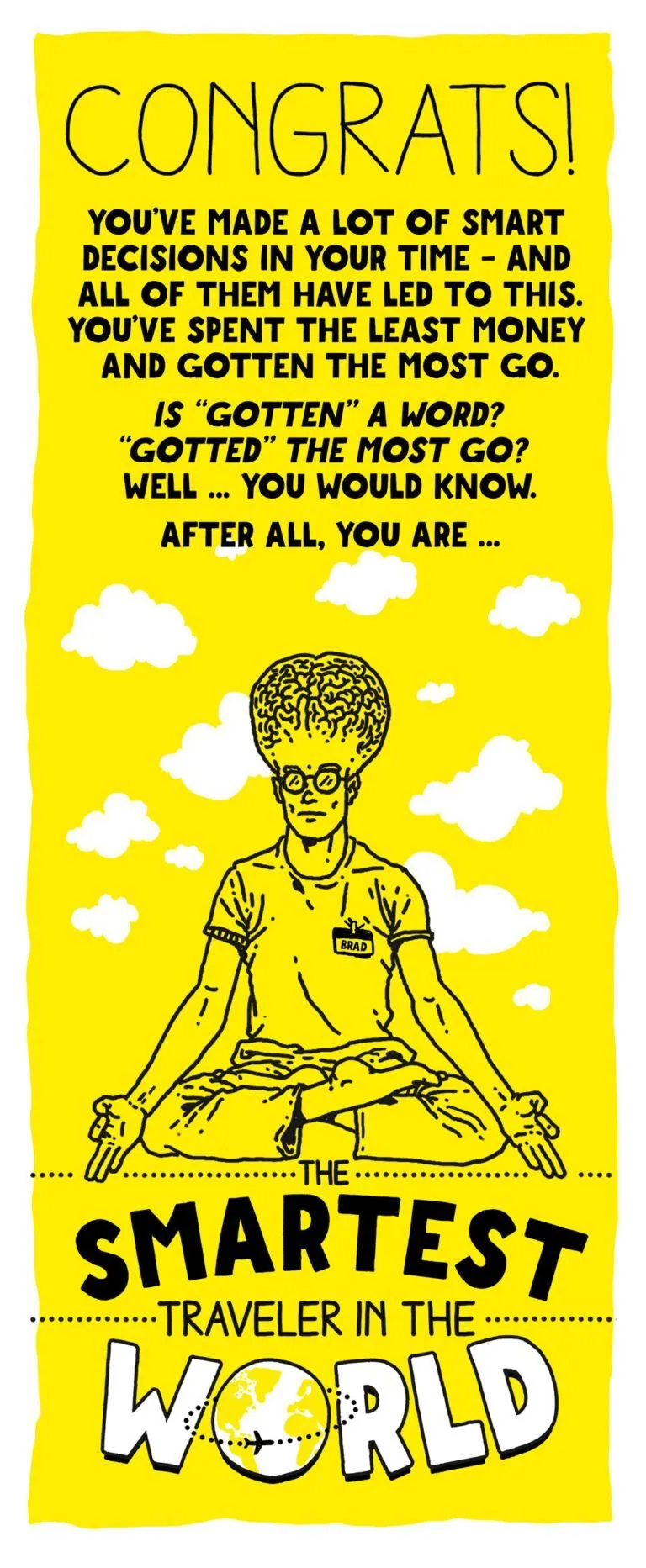
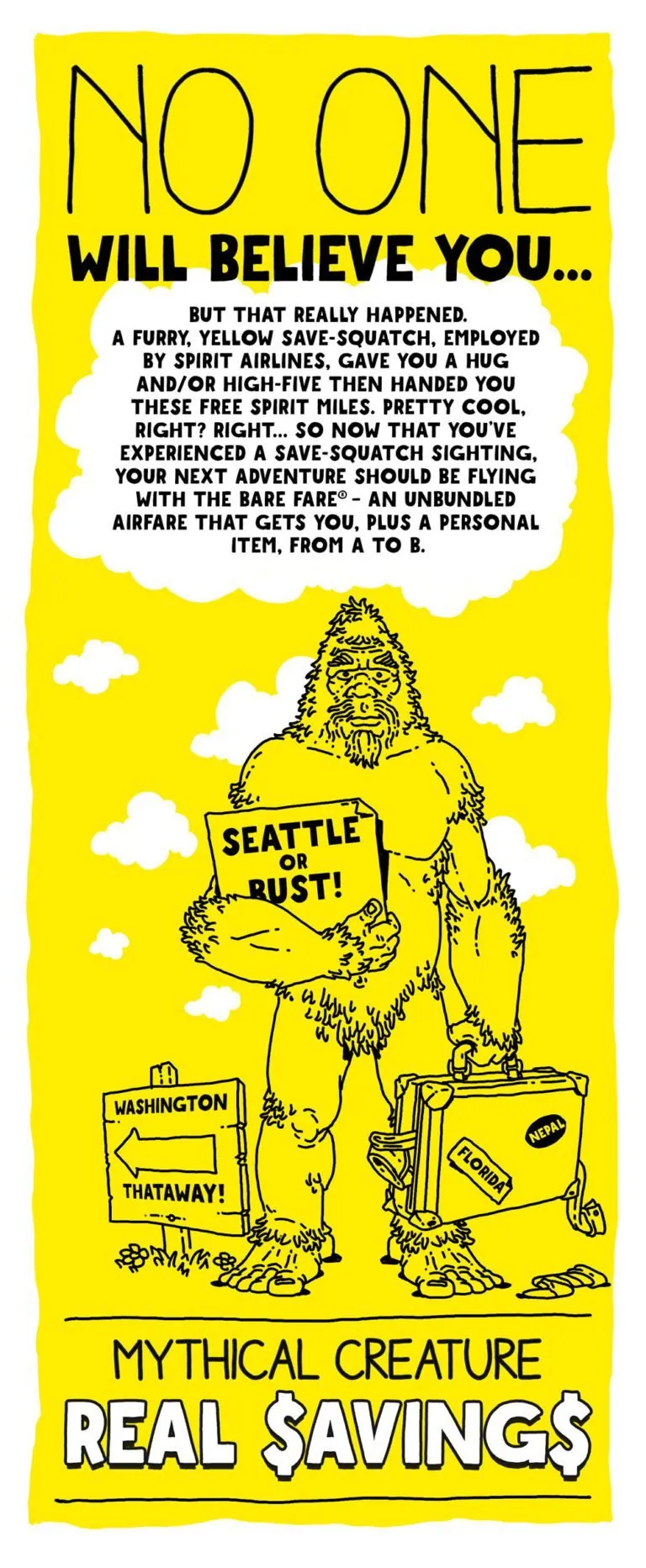
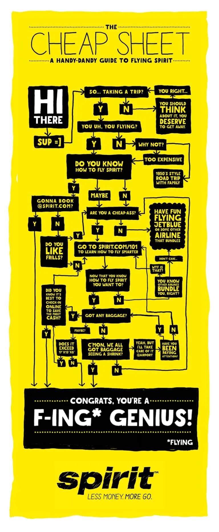
Swipe or drag a screen to scroll it
Bare Fare campaign creative
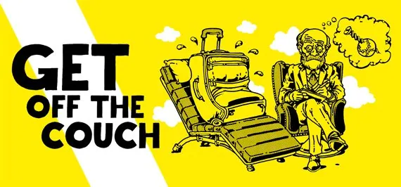
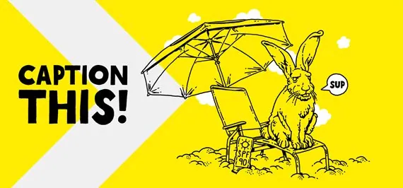
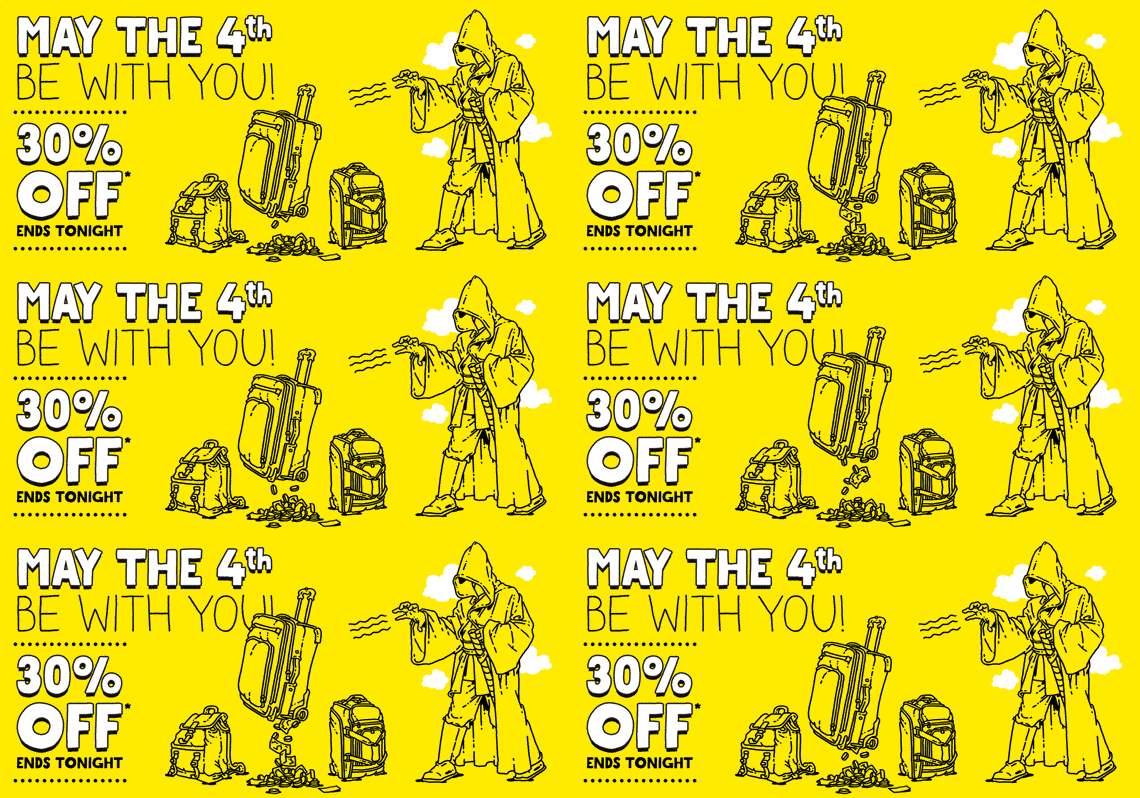
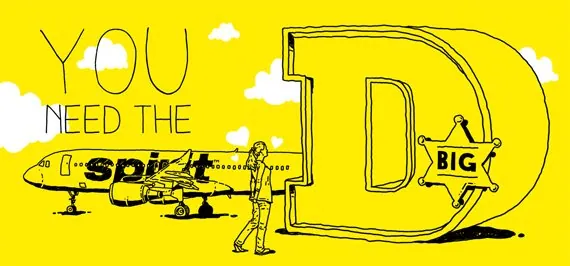
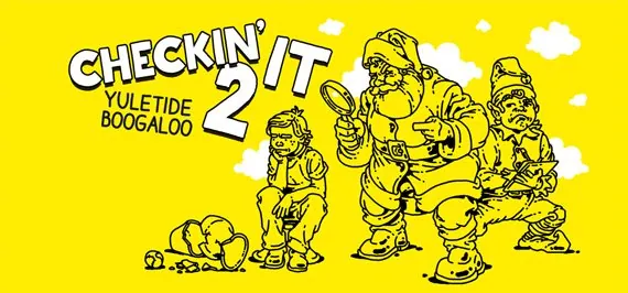
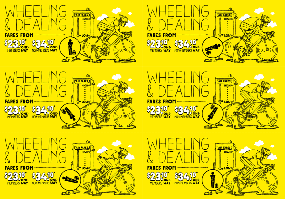
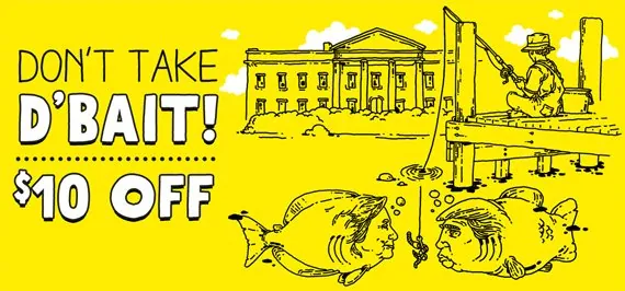
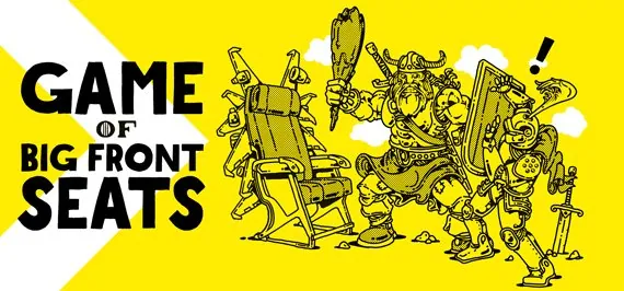
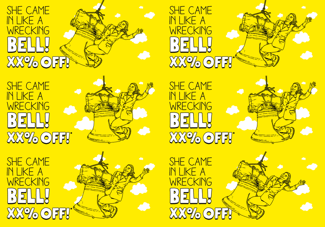
The Bare Fare (2014): Visual editing, animation and post-production contributions by David Keyes. Copyright © Spirit Airlines. All rights reserved.
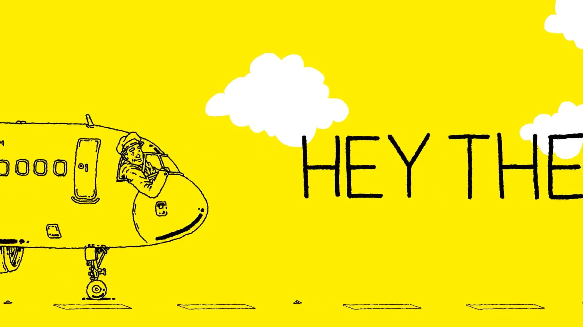
The Bare Fare (2014): Visual editing, animation and post-production contributions by David Keyes. Copyright © Spirit Airlines. All rights reserved.
(05)The execution
Loud ideas, tight control and absolutely no design chaos.
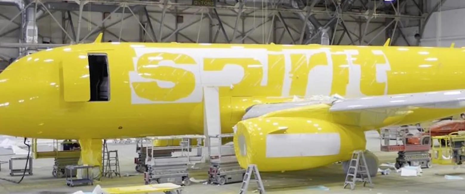
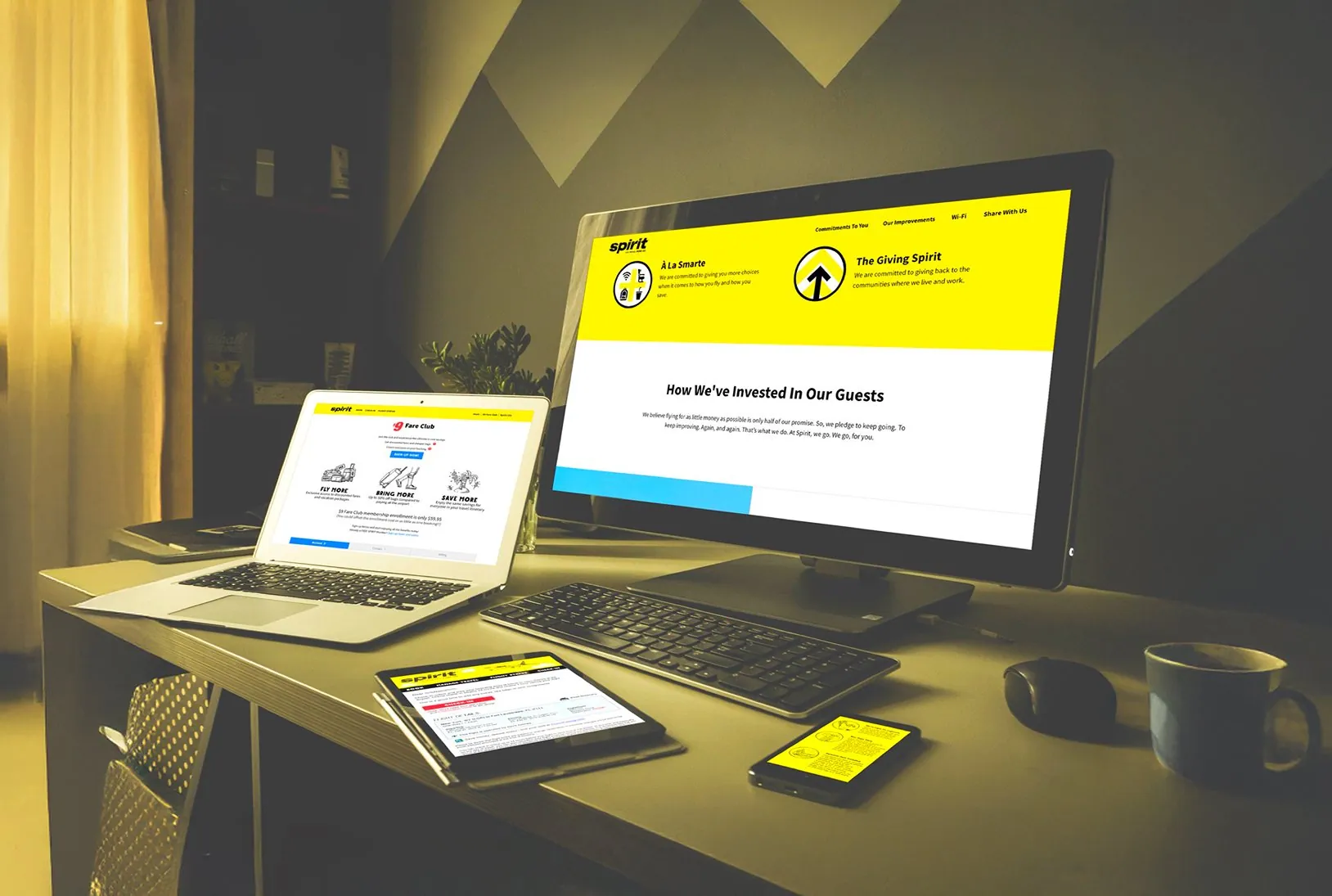
Execution focused on translating Spirit’s unapologetic stance into campaign creative and digital experiences that felt bold without becoming noisy. Website layouts and UX patterns prioritized fast comprehension, allowing humor and attitude to sit on top of an experience designed to work first and entertain second.
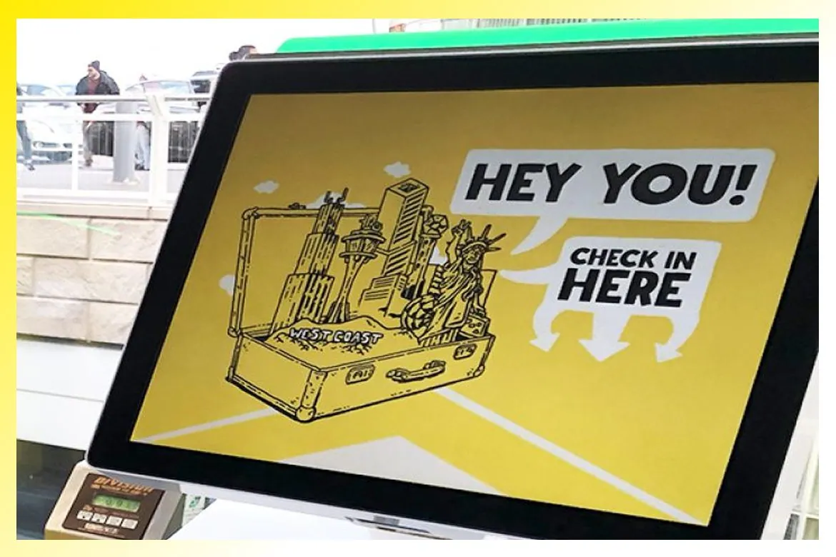 (01)
(01)Say it loud, then make it impossible to misunderstand
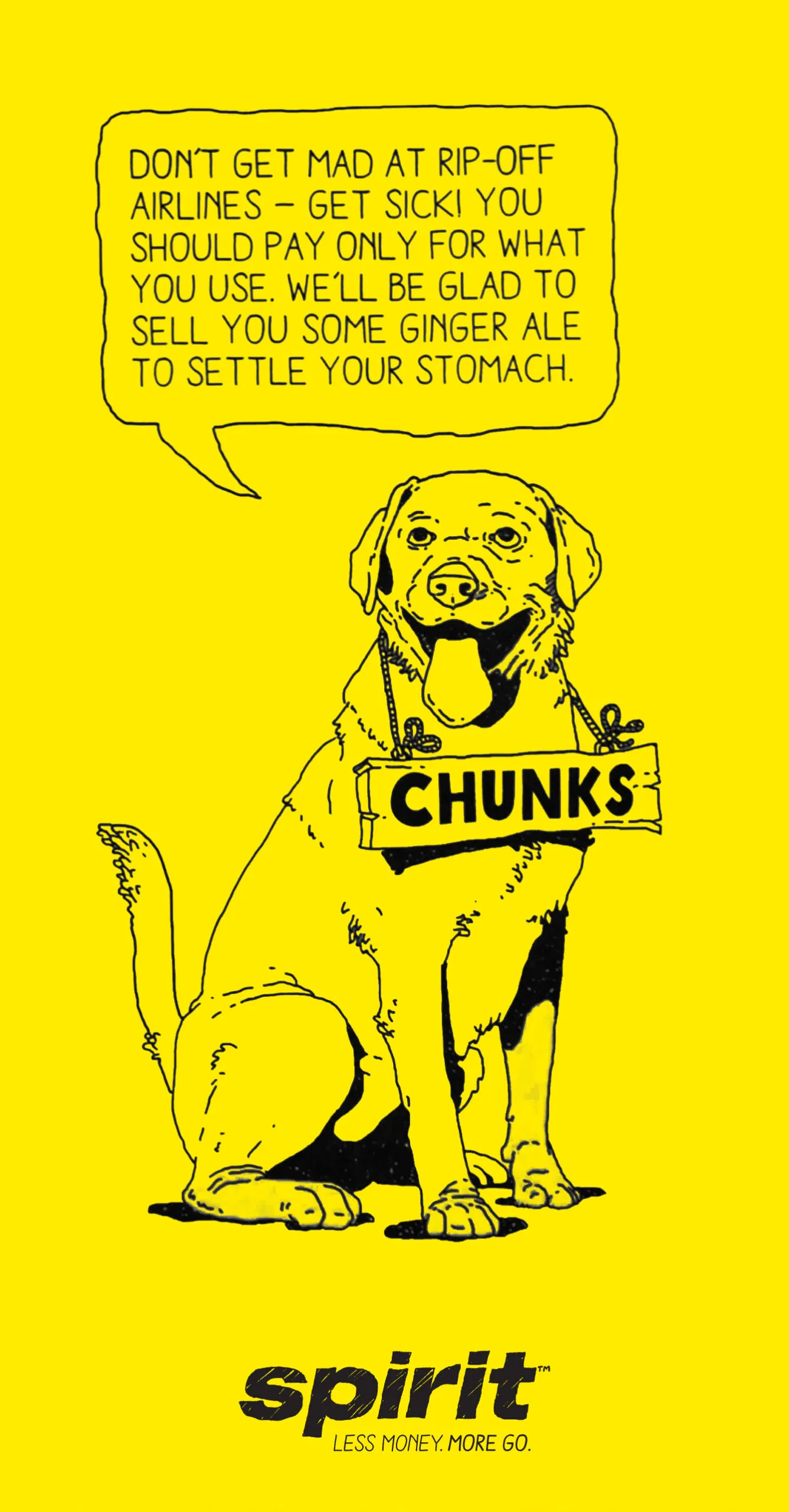
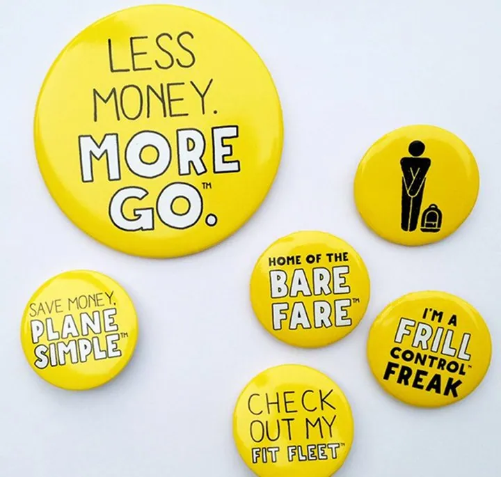
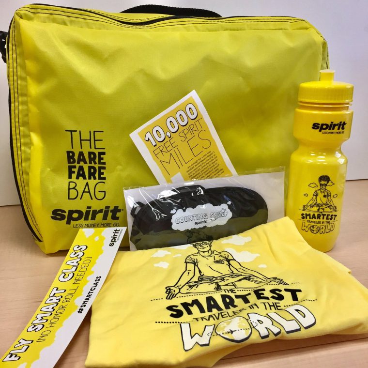
Campaign creative, digital marketing assets and interactive experiences that translated Spirit’s stance into clear, attention-grabbing moments across channels, designed to invite reaction while reinforcing understanding at every touchpoint.
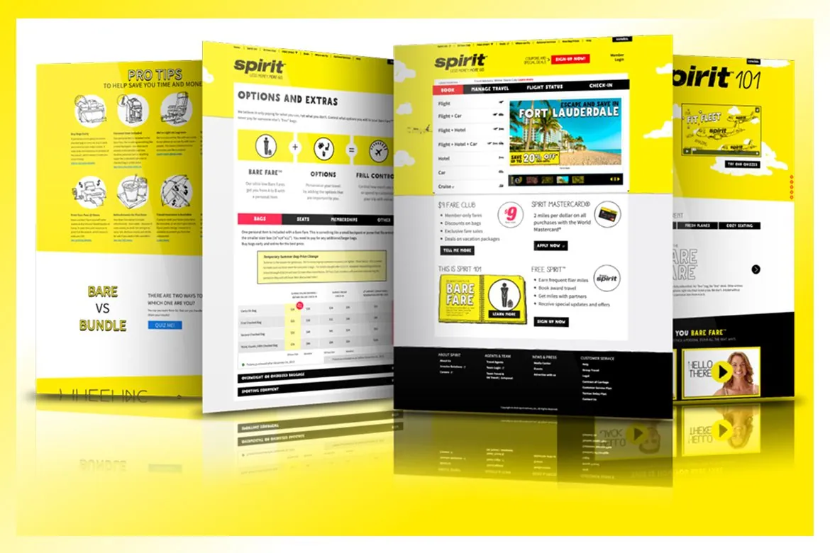 (02)
(02)Make it work first, then let it have a personality
Landing pages, booking flows and UX patterns built on branded UI systems that prioritized clarity, speed and decision-making, so humor supported comprehension and confidence rather than distracting from the experience.
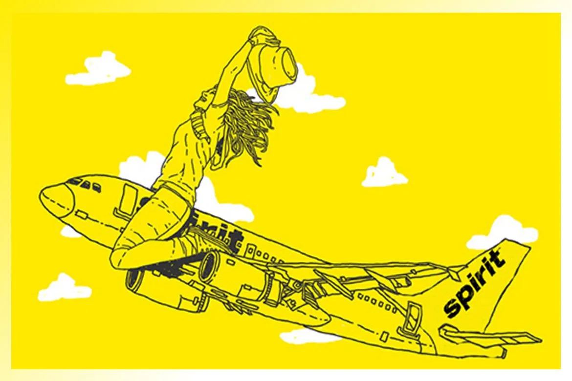 (03)
(03)Bold enough to be funny, clear enough to be trusted
Illustration and motion assets that modernized the brand voice while holding strict accessibility standards and a disciplined messaging hierarchy, so personality showed up without costing legibility or trust.
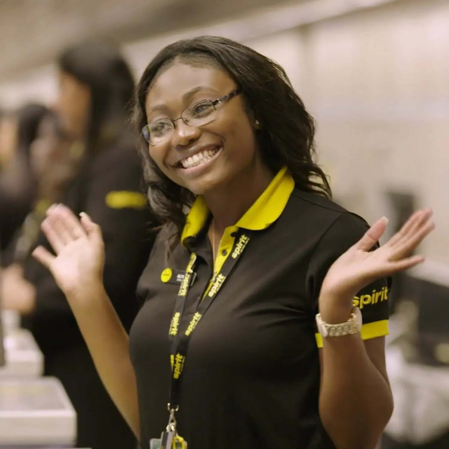
(06)Leadership and collaboration
Holding the line while the plane is still boarding.
This work was developed within a large, fast-moving brand organization. Internal leadership set direction. Cross-functional teams moved quickly across channels. My role was to translate strategy into execution, protect creative quality and keep things consistent as ideas moved from concept to live environments.
What I did
- Collaboration with internal leadership and marketing teams
- Creative stewardship through review cycles
- Cross-functional coordination with digital and web partners
- Asset systems for campaign consistency
- Rapid iteration support for live campaigns
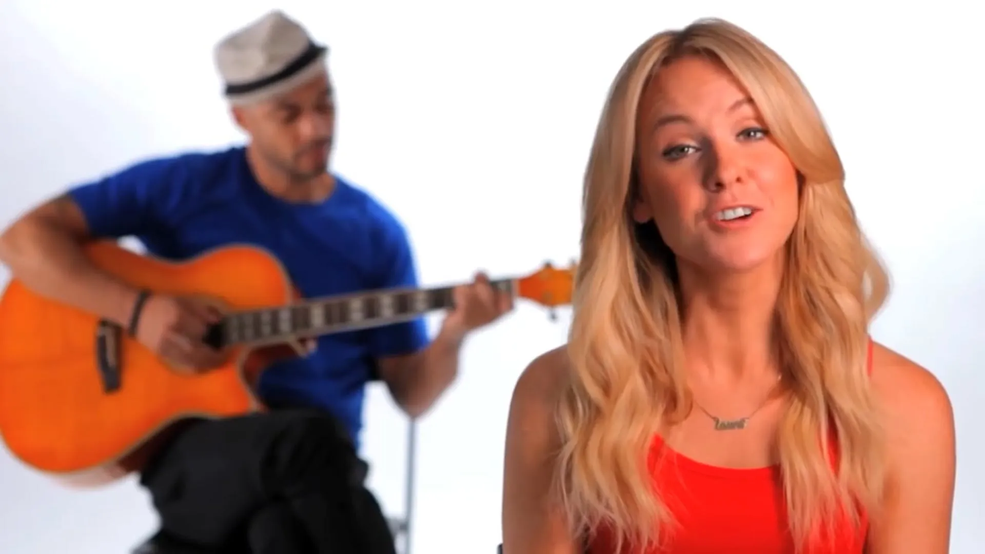
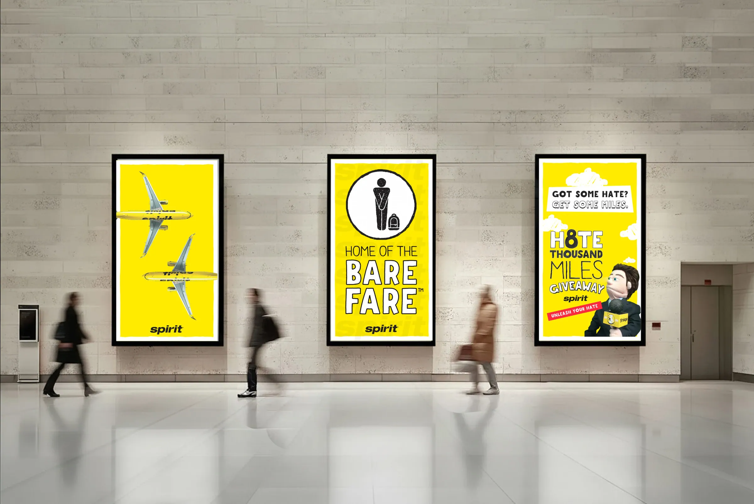
Hug the Haters (2014): Visual editing, animation and post-production contributions by David Keyes. Copyright © Spirit Airlines. All rights reserved.
What people said back




 Natasha Stevens@1NatashaStevens
I’d love to know who does @spiritairlines marketing because their campaigns are hitting pop culture hard. It’s a twist on Southwest 2001.
 Jane Doe@SweetieTweety__
@SpiritAirlines really? 😂 I’d love to be in one of your marketing meetings. These emails are awesome!
 Jon Glenn@TheJonGlenn
@SpiritAirlines the people who write your promotional emails deserve an award! #Hilarious
(07)The impact
Sorry, not sorry. Turns out clarity gets attention.
Spirit took intentional risks that ran counter to conventional airline marketing. The response proved the approach worked. By pairing transparency with disciplined execution, the campaigns generated attention, engagement and measurable brand lift without softening the message.
- 54K+Campaign entries
Key achievements
- Widespread national earned media coverage
- Significant year-over-year improvement in Net Promoter Score
When customers understood the deal, confidence followed.
Leadership perspective
“Let’s not let anybody be surprised about Spirit. Let them know exactly who we are.”
 Ben BaldanzaCEO, Spirit Airlines. USA Today, May 7, 2014
Reflection
“Spirit Airlines reinforced that when a brand chooses provocation, creative decisions stop being expressive and start becoming operational.”
(08)The closing
Confidence isn’t loud. It’s repeated, predictable and hard to screw up.
Spirit did not attempt to soften its reputation. It clarified it. By treating execution as a system rather than a stunt, the work avoided provocation for provocation’s sake and focused instead on helping people understand the trade-off quickly and confidently.
This project shows how strong brands are built not by louder ideas, but by intentional execution across every moment where judgment is formed.
About this case study
This case study explores how visual strategy, UX clarity and campaign discipline support provocative brand positions in high-visibility consumer categories. It highlights the role of art direction and creative implementation in translating leadership-defined positioning into scalable digital experiences.
References
- O’Leary, Noreen. “Spirit Airlines Launches New Ad Strategy.” Adweek, 7 May 2014. adweek.com (opens in a new tab)
- “Strip Down and Save With Spirit’s Bare Fare.” Spirit Airlines news release, 7 May 2014. ir.spirit.com (opens in a new tab)
- “Spirit Airlines Hugs the Haters, Giving Away One Billion Miles.” Spirit Airlines news release, 8 July 2014.
- “Spirit Airlines Rebrands Around the ‘Bare’ Essentials.” RBB Communications. rbbcommunications.com (opens in a new tab)
- McCartney, Scott. “Spirit Hopes to Win Over Fliers With Brand Overhaul.” USA Today, 7 May 2014. usatoday.com (opens in a new tab)
- “Spirit Airlines CEO Discusses Brand Overhaul.” Fox Business, 7 May 2014. foxbusiness.com (opens in a new tab)